
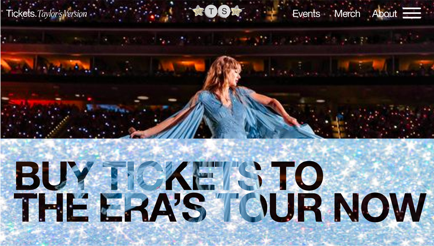
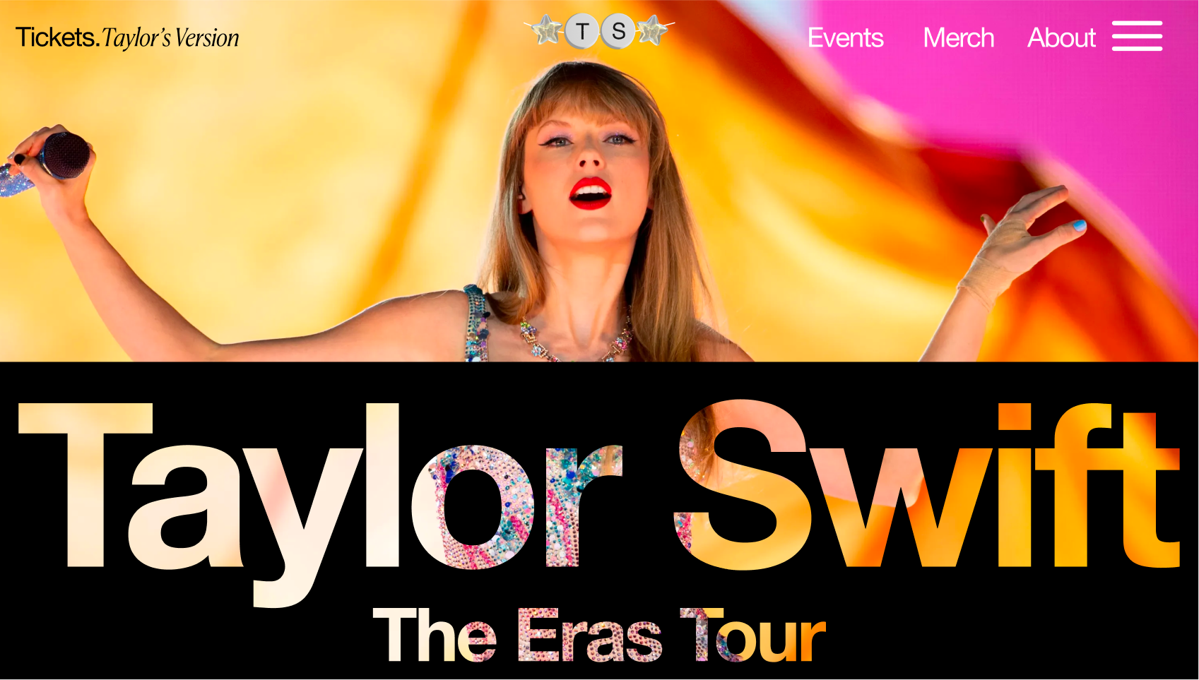
Taylor Swift’s Ticketmaster
As part of a design challenge, I reimagined what Ticketmaster would look like if it were specifically made to cater to Taylor Swift’s needs. This is website that includes a place to browse and buy Taylor Swift concert tickets, look through her merchandise, and a hub for all things Taylor!
Role
Product Designer
Disciplines
UI/UX Design, Product Design, Prototyping in Figma
Timeline
3 Days
Project Scope
Create a reliable, trendy, and central hub for Taylor Swift to sell concert tickets efficiently - her very own “Ticketmaster.”
Deliverable
An interactive website that combines Taylor Swift’s current site with Ticketmaster’s ticketing capabilities. The product will feature an intuitive user flow including a landing page, merchandise browsing, an easy-to-read ticket schedule interface, and a seamless ticket purchasing journey—all made to fit her brand aesthetic and fan expectations.


Background
In 2022/2023, Swift’s popularity was at new heights, with millions of fans looking to buy tickets to her Eras tour concert.
Problem
However, lifelong fans were extremely disappointed when they couldn’t purchase tickets - blaming Ticketmaster.
Ticketmaster simply wasn’t equipped to handle the sheer amount of fans - causing the site to crash and leave fans ticketless or waiting unexpectedly long times in a vague online queue.
HMW


How might we design a trendy, fan-centric hub for Taylor Swift that reliably supports ticket and merch purchases while reflecting her aesthetic?
Process

Research + Brainstorming
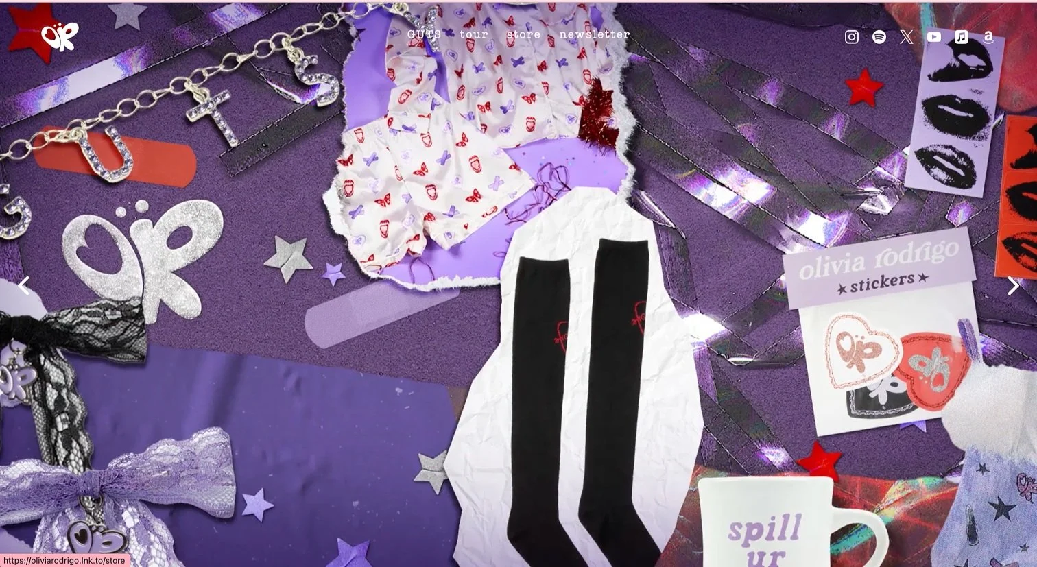
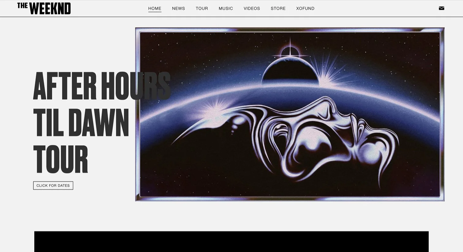
First, I conducted competitor analysis by looking at what other relevant Gen-Z artists’ websites looked like. My goal was to strike a balance in aesthetics, drawing inspiration from the modern-art vibe of The Weeknd while infusing elements of Olivia Rodrigo's overtly Gen-Z feel.
Ideation and Iteration
The directions I ✨did not✨ choose!
Potential Option #1
I decided not to go in this direction despite the fact that it’s visually strong because it felt impersonal.

Potential Options #2 & #3
Personally, I liked these looks a lot but doesn’t quite feel like Taylor’s aesthetic / brand at the time. It also doesn’t feel as accessible or relatable to her wider audience.


Features
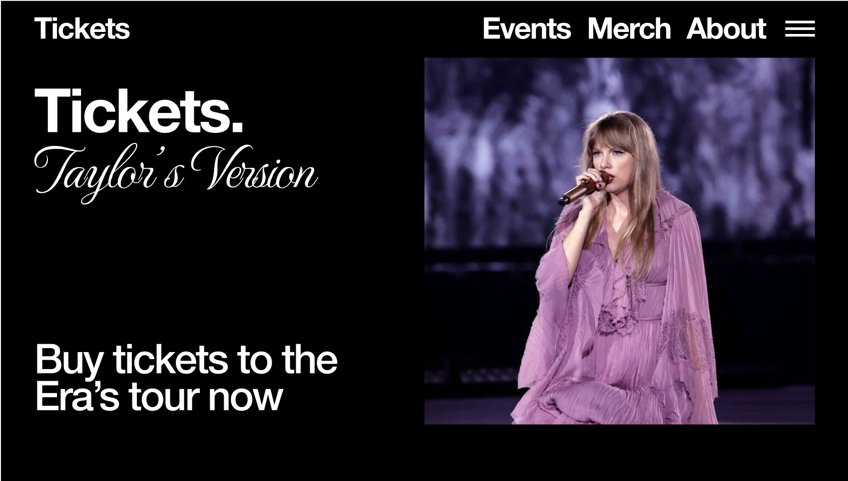
A visually appealing home page tailored specifically for Taylor Swift fans.
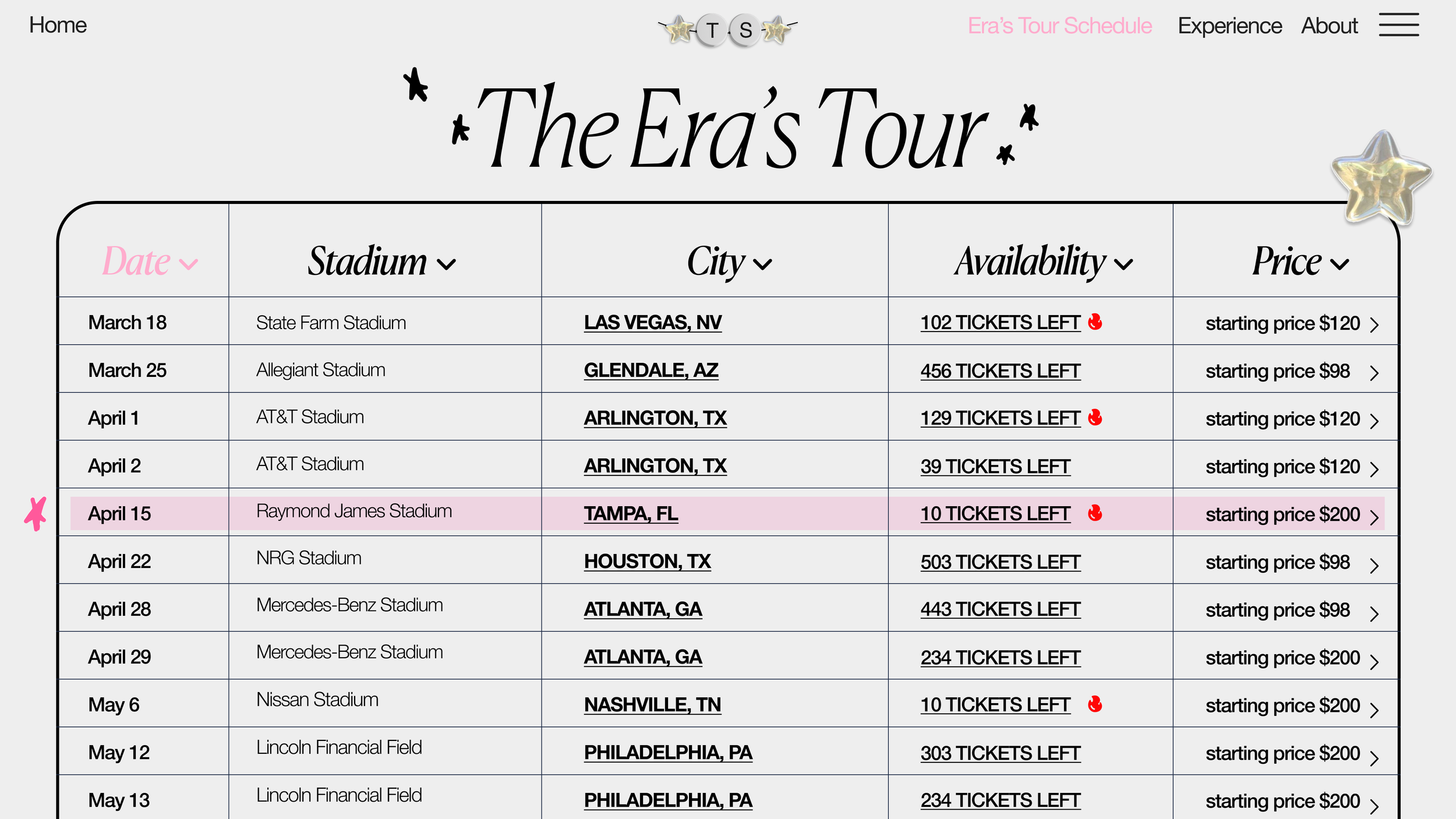
Implemented sortable tour dates, enabling users to organize events based on specific criteria, with a prominent feature highlighting the next upcoming event.
Enhanced merchandise section with sorting options using tags, including hidden “easter egg” tags for added fun.
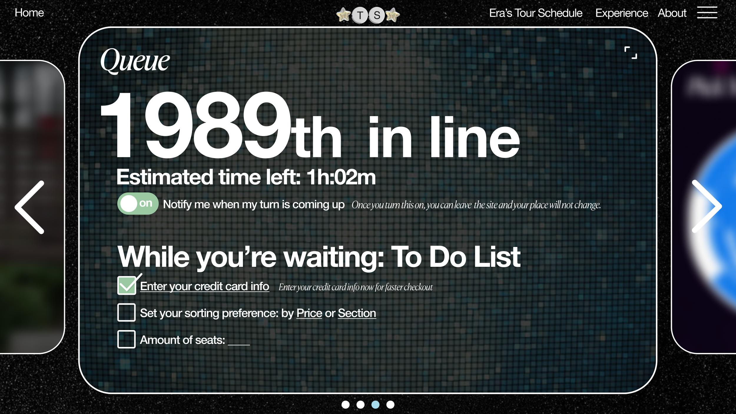
Developed a more transparent, user-friendly, and efficient Ticketmaster experience.
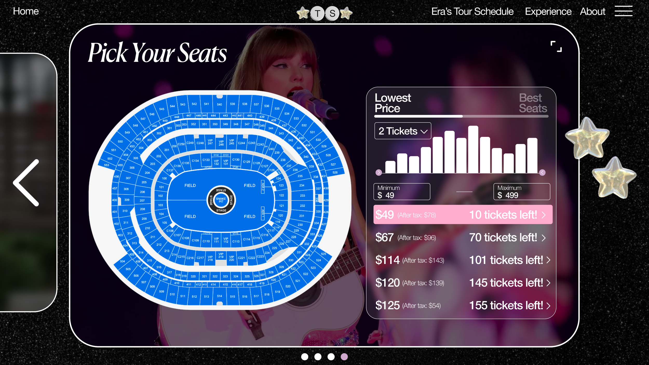
Introduced a simplified ticket selection process, making it easier for users to find tickets at the best price.